 Skip to navigation
Skip to main content


Your Website Is Both Brand and Brochure: Why a Great Site Matters

There was a time when the role of a company website was relatively straightforward. It provided an address, a telephone number, an overview of the business and perhaps a few pages describing its products or services. It was essentially the digital equivalent of a corporate brochure, useful to have and increasingly expected, but not necessarily central to how the business operated or how customers made decisions. That distinction has largely disappeared. For many organisations today, the website is one of the first meaningful interactions a potential customer will have with the company, and in some cases it will be the only interaction before that person decides whether to make contact, request a quotation, book an appointment or purchase a product.
This has changed the commercial importance of web design considerably. A potential customer may discover a company through Google, see an advertisement on social media, receive a recommendation from a colleague or encounter the brand at an event. Whatever creates the initial awareness, one of the next steps is very often the same: they visit the website. They may spend several minutes researching the company or less than thirty seconds deciding whether it looks relevant. Either way, an impression is being formed before anybody inside the organisation has had the opportunity to speak to them. The quality of that experience therefore matters in a way that extends well beyond aesthetics.
A modern business website sits somewhere between a corporate brochure, a brand environment and a commercial tool. It explains the organisation, but it also represents it. It provides information, but it also influences perception. It supports marketing campaigns, generates enquiries, provides evidence of previous work and, increasingly, connects with the wider systems used to run sales and marketing. Looking at the website purely as a collection of pages consequently misses much of its actual value.
Your Website Is Part of the Brand, Whether You Intend It to Be or Not
Branding is often discussed primarily in visual terms. Companies think about logos, colours, fonts, photography and graphic standards, all of which are important. The more significant question, however, is what those elements collectively communicate. A brand is ultimately the impression people develop through repeated interactions with an organisation, and the website is one of the few places where almost every aspect of that impression comes together at once.
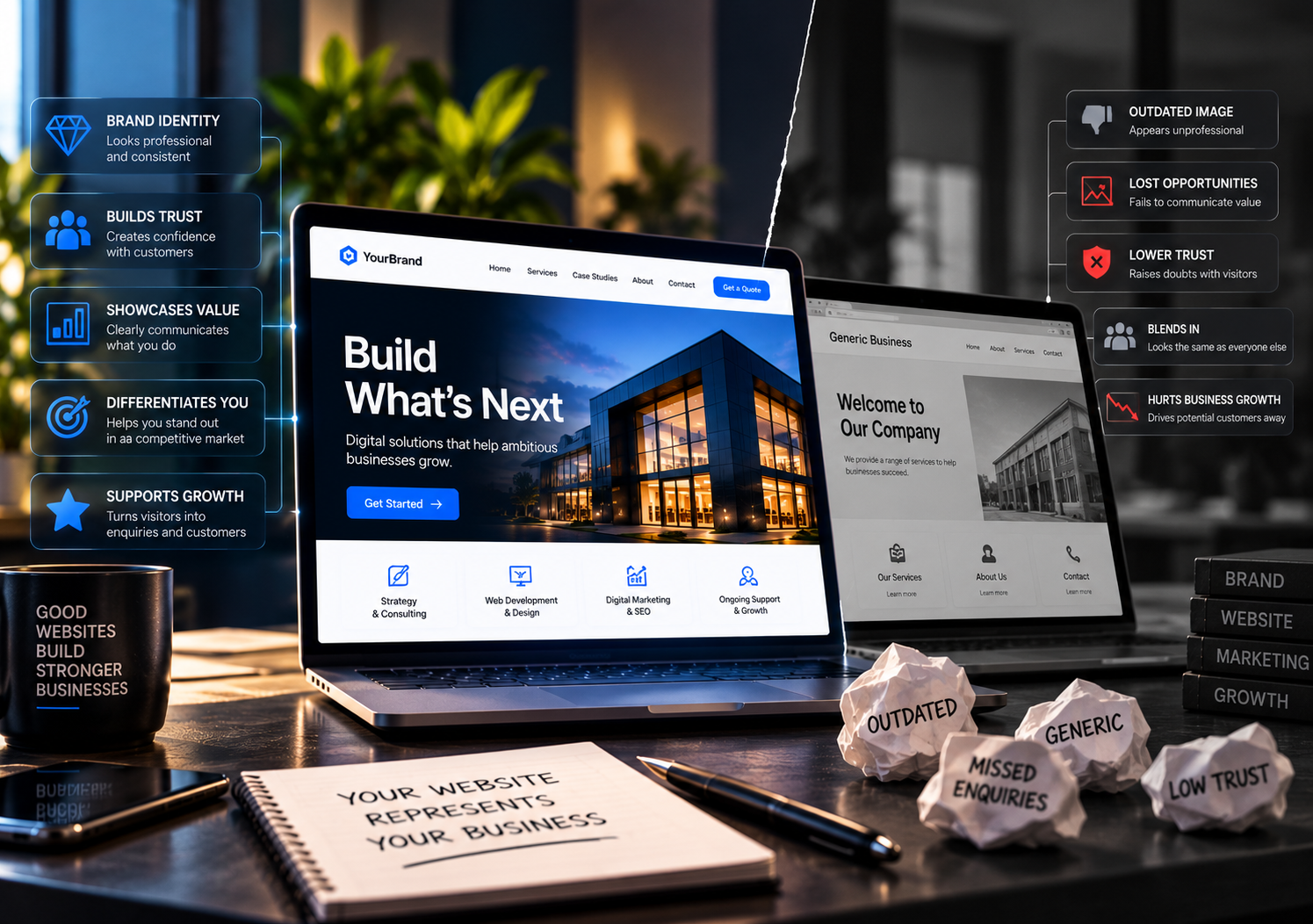
Consider two companies competing for the same customer. Their services may be similar, their teams equally experienced and their pricing relatively close. One has a website that loads slowly, contains dated information, uses inconsistent imagery and makes it difficult to understand exactly what the company offers. The other has a fast, well-structured website that explains its services clearly, presents relevant examples of its work and makes contacting the business straightforward. The second website does not prove that the second company is better at delivering the service. It does, however, give the potential customer more reasons to feel comfortable continuing the conversation.
That distinction matters because customers rarely make decisions with complete information. Before working with a business, particularly a service business, they rely on signals. They look at how the company presents itself, whether information is clear, whether claims are supported by evidence, whether the organisation appears established and whether the overall experience feels credible. A website cannot manufacture genuine expertise, but it can communicate existing expertise effectively. Equally, a poor website can make a capable organisation appear less professional than it really is.
This is particularly important for businesses where trust forms a significant part of the purchasing decision. A customer choosing an accountant, solicitor, consultant, construction company, technology provider or marketing agency is not simply buying a predefined product. They are placing confidence in people they may not yet know. The website becomes part of the evidence they use to reduce that uncertainty. Clear service information, real case studies, professional presentation, visible contact details and thoughtful content all contribute to that process.

Good Web Design Is Primarily About Communication
A common starting point for a website redesign is the desire to make the site look more modern. There is nothing wrong with that objective, particularly when an existing website genuinely feels dated, but appearance alone is a fairly limited definition of good web design. The real job of design is to make information easier to understand and actions easier to take.
Businesses often struggle with this because they naturally organise information according to how they understand themselves internally. Departments, service categories and terminology that make perfect sense inside the organisation can be confusing to somebody encountering the company for the first time. The visitor does not necessarily understand the company's internal structure, nor should they have to. They are usually trying to answer much simpler questions: Does this company provide what I need? Does it work with businesses like mine? Can I trust it? How does the process work? What should I do next?
A professionally designed website should answer those questions without making the visitor work unnecessarily hard. This affects everything from navigation and page structure to headings, content and calls to action. If somebody needs to visit six pages before understanding what a company actually does, the problem is not necessarily the visitor's attention span. It may simply be that the website has been organised around the business rather than around the customer.
This is also why minimalism for its own sake is not always good design. Removing information can make a page look cleaner, but if the customer needs that information to make a decision, the visual improvement may create a commercial problem. Conversely, adding every available piece of information to the homepage does not make a website more useful. Effective design involves hierarchy: understanding what a visitor needs first, what they may need next and what can reasonably wait until later in the journey.
The best websites often feel simple precisely because considerable thought has gone into deciding what should appear where.
The Website Is Where Marketing Has to Deliver
The commercial role of the website becomes even clearer when looking at the wider marketing operation. A business may invest in Google Ads, Meta advertising, LinkedIn campaigns, SEO, email marketing, social media and offline promotion, but a significant proportion of those activities eventually direct potential customers to the same destination.
The website is where the promise made by the marketing campaign has to be continued.
If an advertisement is clear and compelling but sends the visitor to a confusing landing page, some of the value created by the campaign is immediately lost. If a company achieves strong organic search visibility but the website looks untrustworthy when people arrive, rankings alone will not produce the desired commercial result. If an email campaign generates interest but the linked page takes too long to load on a phone, the marketing team has paid for attention that the website then struggles to retain.
This is one reason website investment should not be considered separately from marketing investment. Spending more money generating traffic while ignoring the quality of the destination is rarely an efficient strategy. Before increasing advertising budgets, businesses should understand whether the website gives that additional traffic a reasonable chance of becoming enquiries, bookings or sales.
This does not mean every page needs aggressive sales messaging. In many industries, particularly those involving higher-value services, the website's job is not to force an immediate conversion. Its role may be to provide enough confidence and information for the visitor to move to the next stage. That could mean reading a case study, viewing another service page, downloading information or simply making contact. The appropriate conversion depends on the business and the customer journey.
What matters is that the journey has been considered rather than left to chance.
Content Does More Commercial Work Than Many Businesses Realise
The visual side of a website naturally receives attention because it is immediately noticeable. Content tends to be treated as something to add once the design is nearly finished. In practice, the words on a website carry much of the responsibility for explaining why the business deserves consideration.
This is where many corporate websites become surprisingly similar. Phrases such as “innovative solutions,” “customer-focused approach,” “high-quality services” and “solutions tailored to your needs” appear everywhere because they sound professional and are difficult to disagree with. The problem is that they tell the customer almost nothing that another company could not say.
Useful website content is more specific. It explains what the company does, which problems it solves, who it works with and what the engagement actually looks like. It anticipates sensible questions rather than filling space. It gives the reader enough substance to understand whether the organisation is relevant to them.
This is also where a company can demonstrate expertise without repeatedly claiming to be an expert. A business that publishes genuinely useful articles, explains complicated subjects clearly, presents detailed case studies and discusses the realities of its industry tends to communicate competence more convincingly than one that simply describes itself as “leading.”
Content therefore serves several purposes simultaneously. It supports search visibility, provides material for marketing, helps customers research the company and gives sales teams useful resources to share during longer buying processes. Over time, a strong website can become a library of the organisation's knowledge rather than merely a description of its services.
The Website Continues the Sales Conversation When Nobody Is There
One of the most commercially useful characteristics of a website is also one of the most obvious: it is always available. Customers research companies outside normal working hours, from different time zones and at different stages of their buying process. The business does not know when somebody will decide to investigate it.
A well-developed website can handle a surprising amount of that early sales conversation independently. It can explain the service, introduce the team, answer common questions, present examples, clarify the process and provide an appropriate next step. By the time a serious prospect makes contact, they may already understand a significant amount about the company.
For organisations with longer or more complicated sales cycles, this can improve the quality of enquiries. Instead of every conversation beginning with a basic explanation of what the business does, prospective clients can arrive better informed. The sales team can then spend more time discussing the actual problem, requirements, timing and fit.
This is where case studies are particularly valuable. A service page tells a customer what the company says it can do. A good case study demonstrates what happened when it actually did it. The same applies to testimonials, project examples, client stories and detailed portfolio work. They move the website from assertion towards evidence.
A brochure can describe a business. A properly developed website can help a customer evaluate it.
Mobile Has Changed What “Professional” Means
The desktop version of a website is often where businesses focus their attention during design reviews because it provides more space and tends to look more impressive on a large monitor. Customers do not necessarily experience the website that way. Many will first encounter it on a phone, perhaps after a Google search, an advertisement, a social media post or a recommendation sent through a messaging app.
For those people, the mobile website is not an alternative version of the experience. It is the experience.
This creates practical requirements that cannot be solved by simply shrinking the desktop layout. Navigation needs to remain obvious, buttons need to be usable, forms need to be manageable and content needs to retain a clear hierarchy on a much smaller screen. Performance becomes particularly noticeable because mobile users may not always be using fast connections. A visually impressive page that requires large amounts of data and several seconds before it becomes usable can quickly undermine the experience.
Mobile design is therefore not an optional refinement or something to consider after the desktop website is complete. It should be part of the same design process from the beginning.
The same principle applies to accessibility more broadly. A professional website should not create unnecessary barriers for people trying to use it. Clear contrast, sensible typography, logical navigation, meaningful page structure and properly implemented forms are good usability practices as well as accessibility considerations.

What Happens Behind the Website Matters Too
The customer primarily experiences what appears on the screen, but the quality of a website also depends on infrastructure they will rarely see. Hosting, performance optimisation, security, backups, analytics, technical SEO and ongoing maintenance all influence whether the website can continue performing its role reliably.
This becomes particularly important as the site grows more connected to the rest of the business. A modern website may send leads into a CRM, receive traffic from paid advertising campaigns, process transactions, connect with email marketing software, collect analytics data and communicate with other systems through APIs. It is no longer necessarily an isolated marketing asset.
The more commercially important those connections become, the less sensible it is to treat the website as something that was simply “finished” on launch day.
Software changes. Security updates are released. Services change. Staff members come and go. Tracking requirements evolve. New landing pages are required. Search engines change how they interpret content. Customers begin using different devices. The website needs to be capable of adapting to those changes.
This does not mean businesses should constantly redesign their websites. A good website should have enough structural quality that it does not need to be reinvented every year. What it does need is ownership: somebody responsible for keeping it accurate, secure and commercially useful.
A Website Should Reflect Where the Business Is Going, Not Only Where It Is Today
One of the more difficult decisions in web development is determining how much flexibility to build into the initial project. It is possible to over-engineer a relatively simple website and spend money solving problems the business may never have. It is equally possible to choose the fastest and cheapest solution available and discover eighteen months later that relatively ordinary changes have become difficult or expensive.
The appropriate balance depends on the organisation.
A local company with a small service offering and no plans for significant expansion has very different requirements from a business planning multiple locations, international markets, e-commerce or extensive digital marketing. The technology, content structure and integrations should reflect that reality.
What matters is that the conversation takes place before the platform and architecture are chosen.
If the business expects its marketing operation to become more sophisticated, the website should provide room for dedicated landing pages, analytics, tracking and CRM integration. If international expansion is realistic, multilingual requirements should be considered. If organic search is commercially important, technical SEO and content architecture should not be afterthoughts. If the company expects to sell online later, that possibility should at least be understood when making initial technology decisions.
A good website is built for today’s requirements without unnecessarily restricting tomorrow’s.
A Great Website Does Not Need to Shout
There is a tendency in digital marketing to make websites increasingly aggressive. More pop-ups, more calls to action, more claims, more movement and more attempts to capture attention.
That is not always what a professional business needs.
For many companies, particularly in B2B and professional services, confidence is communicated more effectively through clarity than volume. A well-structured website with good content, considered design and clear evidence does not need to tell visitors every few paragraphs that the company is trustworthy, experienced or industry-leading.
It can demonstrate those qualities.
That distinction is important because customers are increasingly familiar with marketing language. They recognise exaggerated claims and generic promises quickly. Businesses that communicate plainly and provide evidence often appear more credible precisely because they are not trying quite so hard to convince the reader.
Professionalism online is rarely about having the most complicated website or the most dramatic design. It is about making the experience feel considered.
The visitor should understand where they are, what the business does and what they can do next. Pages should load properly. Content should be current. The mobile experience should work. The brand should feel consistent. Claims should be supported. Contacting the business should not be unnecessarily difficult.
None of those things sounds revolutionary.
Together, they make an enormous difference.
Your Website Is Already Saying Something About Your Business
Every business website communicates, including the ones that have not been updated for five years.
The question is whether it is communicating what the company intends.
An outdated website can suggest that the business itself has stopped moving, even when the opposite is true. Poorly written content can make a specialist organisation sound generic. Broken functionality can make an otherwise organised company appear careless. A confusing website can make a straightforward service feel complicated.
The reverse is equally true. A considered website can make the strengths of the organisation easier to see. It can give potential customers confidence before the first conversation, support marketing campaigns, provide sales teams with useful resources and make the company easier to understand.
This is why the idea of the website as a digital brochure is both correct and incomplete.
It is a brochure because it presents the organisation, its services and its credentials. But unlike a printed brochure, it is also interactive, measurable, searchable, adaptable and connected to the rest of the company’s digital activity. It can respond differently to different customer journeys. It can generate enquiries, process transactions, capture data, support advertising and develop into a significant source of organic visibility.
For many businesses, it is also the one brand asset that almost every serious prospective customer will eventually encounter.
That deserves more thought than simply deciding what the homepage should look like.
A great website does not replace a good company, a strong sales team or effective marketing. It makes all of them easier to understand and easier to trust.
And in a market where potential customers can compare several businesses without ever leaving their desk, that matters considerably.
